Your winning ad is losing to your best customers.
A 659,522-impression Facebook test moved click-through rate 125 to 323% on the same creative by subgroup. Your aggregate winner is losing to your best customers.
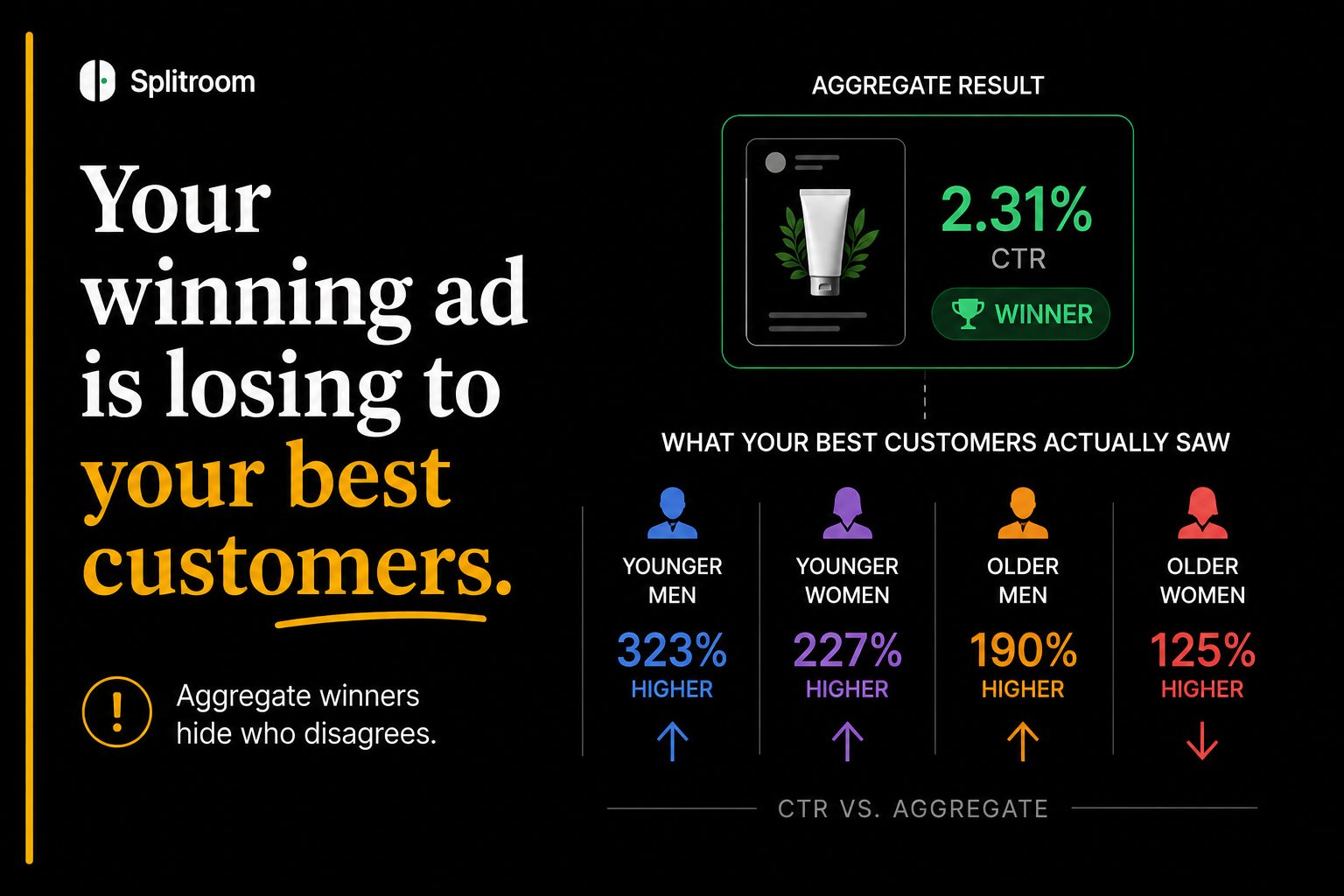
Six hundred and fifty-nine thousand, five hundred and twenty-two Facebook impressions. One teeth-whitening product. Four versions of the same ad, each with a different model: older woman, older man, younger woman, younger man.
Higgins and his colleagues at Ulster University ran the test and reported the aggregate result in the Cyberpsychology, Behavior, and Social Networking journal in 2018. The overall click-through rate looked healthy. The kind of number a media buyer would celebrate. Ship it.
Then they split the same data by who was watching.
Younger men clicked 323% more often when the ad featured a younger man. Younger women clicked 227% more often when the ad featured a younger woman. Older men, 190%. Older women, 125%.[1]
Every aggregate winner was a losing ad for someone.
The paper was published eight years ago. Every commercial creative-testing platform still leads with the aggregate score.
This is the pattern the industry does not want to talk about. The headline winner from a creative test is a story about an audience mix that does not exist in your actual delivery. When you scale that ad on Meta, your best customers are not the average customer. They may be the segment the winning ad performs worst against.
The same ad can move click-through rate by 125 to 323% across demographic subgroups (Ulster University, 659,522 Facebook impressions, peer-reviewed).[1] Aggregate creative test winners routinely disagree with subgroup-level winners because aggregation hides preference reversals inside the panel. This pattern has a formal name in statistics (Simpson's Paradox, documented in Science in 1975 with the UC Berkeley admissions case)[2] and a specific mechanism on Meta: the algorithm reallocates audience mix across variants unequally, so the aggregate score reflects both the creative and the delivery skew.[4] Every major pre-launch creative testing platform (PickFu, Poll the People, Toluna, Marpipe) defaults to aggregate-first reporting.[10] The subgroup dissent that would tell you the ad is bad for your highest-LTV customer sits behind an optional drill-down, if it is available at all.
The pattern has a name, and it is older than digital advertising
In 1975, the journal Science published one of the most-cited papers in the history of applied statistics. Bickel, Hammel, and O'Connell examined UC Berkeley's graduate admissions data for the fall 1973 term. The aggregate numbers looked bad for the university. Roughly 44% of male applicants were admitted, versus 35% of female applicants. Berkeley was being accused of sex bias.
Then they broke the data out by department.
Inside almost every individual department, women were admitted at rates equal to or slightly higher than men. The aggregate bias vanished. What actually explained the gap was that women applied disproportionately to the more competitive departments (English, education), where everyone had lower admit rates, while men clustered in the less competitive departments (physical sciences, engineering).[2]
The aggregate answered one question. The subgroup answered a different question. They gave opposite verdicts. The formal name for what happens when a trend appears in aggregate data and reverses inside every subgroup is Simpson's Paradox, and it is a mathematical guarantee, not a data-quality accident. Any time the group sizes are unequal and the underlying rates differ, the aggregate can point in the opposite direction from what is true inside each group.
The paradox does not require malicious data or bad measurement. It requires two things: heterogeneity between subgroups, and unequal sizes of those subgroups in the aggregate. Every commercial creative test satisfies both.
How the mechanism shows up in a creative test
Consider a two-ad test with 1,000 respondents split evenly across two age brackets, 25-to-34 and 45-to-54. Ad A wins the aggregate 52 to 48. On the dashboard, you ship Ad A.
Inside the age brackets, the picture reverses. Ad B wins among 25-to-34 by 8 points. Ad B wins among 45-to-54 by 3 points. Ad A only leads in aggregate because the 25-to-34 sample happened to over-index on people who preferred Ad A within that bracket for reasons unrelated to age. The aggregate winner loses in every subgroup.
This is not a hypothetical. It is a documented empirical pattern across every field that runs subgroup analysis on aggregate winners. In sponsored-search advertising, a 2014 Marketing Science paper found that repeated ad clicks decreased purchase probability for more than 90% of consumers, but increased it for roughly 10%. The aggregate signal masked a preference reversal that ran in opposite directions inside two different consumer segments. Any account manager acting on the aggregate finding (reduce frequency of repeated exposures) would have taken the wrong action for the specific 10% segment that was driving revenue.[3]
A 2023 paper in the same journal, using causal machine learning on discount-email creative variants, found the same shape. Clearance-framed discount emails outperformed product-specific discounts in aggregate. The magnitude of the outperformance was heterogeneous across customer types. The aggregate winner masked segment-specific losers who would have responded better to the alternative framing.[7]
A December 2025 paper in the Journal of Marketing Research documented spatial heterogeneity in retail advertising effectiveness. Using 6.4 million mobile location traces joined with TV viewership data, Luo and Ranjan found that ad effectiveness was non-monotonic with the customer's distance to the store, and heavily moderated by rival-store proximity. The winning creative for a home-improvement retailer depended on the geographic-competitive mix of the viewer's zip code. An aggregate-optimal creative was geographically wrong for the highest-value zips.[8]
Three peer-reviewed venues. Three different mechanisms. Same structural finding. Aggregate creative winners routinely disagree with subgroup winners in ways that matter for spend allocation.
The Meta version is uniquely bad
The classic Simpson's Paradox setup assumes subgroups get roughly equal exposure. In a well-designed survey panel, that is arranged by construction. On Meta, it is not.
Meta's delivery algorithm is optimizing for early conversion signal. When you run an A/B test with two creative variants, the algorithm does not hold audience allocation constant across the two. It reallocates impressions in response to whichever variant is producing signal, and it does so inside distinct subgroups at different rates. By day three of your test, Ad A may be running against a materially different age-and-gender mix than Ad B. The aggregate winner reflects both which creative performs better and which mix the algorithm decided to feed each variant.
The scale of the confound is now measured. Burtch, Moakler, Gordon, Zhang, and Hill (with two Meta research scientists on the byline) analyzed 181,890 real Meta A/B tests across 27 billion user observations. They found that 22% of tests had clear audience-composition imbalance (standardized mean difference above 0.2) between variants. Meta's own Lift tests, which are engineered to hold audience allocation constant, had audience-composition imbalance in only 0.16% of tests. A 137-times gap between the tool most media buyers use and the tool Meta itself points serious causal-measurement customers toward.[4]
No configuration guarantees eliminating divergent delivery entirely.Burtch et al., 'Characterizing and Minimizing Divergent Delivery in Meta Advertising Experiments,' arXiv 2025
That last line is load-bearing. Even Meta's researchers describe the audience-mix skew as structural to the auction. It is not a bug the platform can patch. It is what the platform is designed to do. Which means on Meta specifically, aggregate creative comparisons are not just susceptible to Simpson's Paradox. They are almost guaranteed to be affected by it, because the algorithm actively manufactures the mix imbalance the paradox needs. (We covered this measurement problem in depth in our companion piece Meta's A/B test measures the algorithm, not your creative.)
Why the industry defaults to the aggregate anyway
Every major pre-launch creative testing platform ships with aggregate-first reporting. PickFu's own help center is explicit about the design: ‘PickFu aggregates their votes to name an overall winner.’ Segment breakouts exist behind an optional drill-down inside the results panel. The primary signal, the number the buyer sees first, is the aggregate.[10]
Poll the People, Marpipe, and Toluna follow the same design pattern. Aggregate rating first, subgroup drill-down secondary. In some competitors, subgroup analysis is a paid tier upgrade.
The reason is not that these companies do not understand the statistics. It is that aggregate-first reporting is easier to sell. ‘Version A won 60 to 40’ is a clean deliverable a media buyer can put in a Slack message. ‘Version A won 60 to 40 in aggregate but lost 55 to 45 among your 34-plus women who accounted for 47% of last quarter's revenue’ is a longer conversation.
The result is a category-wide reporting default that is optimized for shareability, not for correctness. If you are a media buyer running a pre-launch test to decide which creative to scale on Meta, you are making a spend-allocation decision that hinges on the subgroup that your platform's default report is designed to obscure.
Why this specifically matters for how Meta budgets get allocated
Motion's Creative Benchmarks 2026 report analyzed 578,750 Meta ads across $1.29 billion in ad spend from 6,015 advertisers between September 2025 and January 2026. Their base rate for winner concentration: about 6% of ads capture the majority of an account's spend. At micro-spend accounts, the winner tier is roughly 4%. At enterprise, roughly 8%. Roughly 50% of ads run get near-zero spend once the algorithm identifies the concentration pattern.[6]
In an account where 6% of ads take 50-plus percent of spend, being wrong about which 6% is a spend-allocation catastrophe. If your pre-launch test named the aggregate winner, and the aggregate winner happens to be the ad that loses among your highest-LTV subgroup, you have just concentrated your account's budget on a creative that is systematically wrong for your best customers.
| Account tier | % of ads that are 'winners' | % of spend those winners take |
|---|---|---|
| Micro (< $10K/mo) | ~4% | 23% |
| Small ($10K–$50K/mo) | ~5% | 38% |
| Mid ($50K–$500K/mo) | ~6% | 51% |
| Enterprise (> $500K/mo) | ~8% | 64% |
Motion's complementary finding on portfolio breadth adds a second edge. Accounts that ship more creative variety produce roughly twice as many winners at the same budget. The top-spend accounts ship 12 to 19-plus creatives per week, versus a median of 6 to 7. Larger advertisers surface more winners not through smarter prediction, but through more variation.[6] The mechanism is exactly the segment-dissent thesis. Different creatives are winners for different subgroups. Portfolio breadth is what covers the segment space.
Which means the two natural outputs of taking segment dissent seriously are (a) selecting the aggregate winner more carefully and (b) shipping a broader portfolio rather than chasing one aggregate winner to scale. Both are the opposite of what an aggregate-first testing platform quietly encourages.
The honest counterweight: subgroups are noisier
A rigorous version of this argument has to acknowledge the other side. Subgroup readouts are noisier than aggregates. That is a mathematical fact.
With 1,000 respondents split across 8 demographic buckets, you have roughly 125 respondents per subgroup. That is enough for CTR-like binary signal at reasonable effect sizes, but it is not enough for granular multi-metric comparison. And once you start running significance tests across multiple subgroups on multiple metrics, the multiple-testing problem inflates your false-discovery rate fast. With 8 metrics tested at the standard α = 0.05, the family-wise error rate reaches roughly 34%. One in three of your ‘statistically significant’ subgroup findings will be noise.[9]
Meta's own practitioner threshold for exiting the Learning Phase on a live ad set is 50 conversion events per week. Below that, the platform does not consider the signal reliable enough to optimize against. The same principle applies to subgroup readouts in a pre-launch test. A subgroup with fewer than about 50 observations of the outcome you care about is not delivering a verdict you can bet spend on.
Subgroup dissent is real, and often decisive. It is also noisier than aggregate signal. Both are true. A defensible operating rule: a subgroup verdict must exceed a sample-size floor (roughly 50 outcome events per subgroup), and multiple-testing correction must be applied when comparing across many subgroups on many metrics. Under those conditions, subgroup dissent is trustworthy. Absent them, it is a hypothesis, not a decision.
This is the version of the argument that has to survive the objection. The point is not to treat every subgroup wobble as a verdict. The point is to notice when the aggregate winner and a materially-sized, statistically-clean subgroup disagree, because that disagreement is the moment where the aggregate is the wrong story for your best customers.
What Splitroom does about this (and what it does not)
Splitroom does not eliminate the subgroup sample-size floor. No pre-launch test with a fixed panel can. What it does structurally is remove the aggregate-first reporting default, and remove Meta's divergent-delivery confound entirely by construction.
Every panelist in a Splitroom run evaluates every ad on the same scorecard. There is no auction, no Learning Phase, no algorithmic reallocation of audience across variants. Ad A and Ad B are judged by the same 1,000 respondents in the same conditions. Which means subgroup breakouts are pre-built into every readout, not a paid drill-down that appears if the buyer knows to click for it. The 34-plus women subgroup, the high-income subgroup, the region subgroup — all get the same scorecard on both ads by default.
The structural claim is narrower than ‘Splitroom prevents Simpson's Paradox in creative testing.’ The paradox can still show up inside a Splitroom readout if the audience mix in the panel does not match your Meta audience mix, or if a specific subgroup is under-sampled. What Splitroom does is make the subgroup dissent visible instead of buried, and remove the Meta-specific delivery confound that inflates the paradox's frequency on-platform. Whether the buyer acts on the dissent is still the buyer's decision.
The industry design pattern is: aggregate score is the primary signal, subgroup breakouts are an optional drill-down. Splitroom inverts it. Because the same panel evaluates every ad, the subgroup grid is the readout. If Ad A wins 55 to 45 aggregate but loses 60 to 40 among your highest-value segment, that is not a paid feature. That is the report.
The word average is doing more work than it deserves
In 2004, the mathematical psychologist Peter Molenaar published a formal proof of what has come to be called the ergodicity problem. The short version: aggregating measurements across a heterogeneous population produces statistics that describe no actual member of that population. The aggregate is a mathematical object, not a person.[5] Todd Rose's 2016 book The End of Average made the argument accessible to a general audience. The historical example he uses is a 1950s U.S. Air Force study that measured 4,063 pilots across 10 body dimensions to design the average cockpit. Zero pilots fit the average on all 10 dimensions.
This is what an aggregate creative-test winner is. It is the ad best suited for a customer who does not exist. Your actual customers are members of subgroups, and the aggregate winner is a compromise across subgroups whose preferences pull in different directions.
Sometimes the compromise is close enough that shipping the aggregate winner is a defensible call. Sometimes it is not, and the subgroup that lost the aggregate vote is the one funding your business.
The pre-launch test that only shows you the aggregate cannot tell you which one you are in. The pre-launch test that shows you both can.
Every creative test produces a winner. Not every winner is winning against the customer you care about most. That is the number to know before the ad spend flows.
Fair questions
What does 'your winning ad is losing to your best customers' actually mean?
The aggregate score from a creative test is an average across everyone in the panel. Averages hide preference reversals inside subgroups. A creative can win the overall vote 52 to 48 and lose 60 to 40 inside your highest-LTV segment, because the segments that pulled the aggregate score up are different from the segments funding your business. The formal statistical name is Simpson's Paradox, first documented in the UC Berkeley admissions case in Science in 1975.
How much can the same ad actually move across demographic subgroups?
The most rigorous published number is from Higgins et al. at Ulster University in 2018, peer-reviewed in Cyberpsychology, Behavior, and Social Networking. Across 659,522 Facebook impressions on a teeth-whitening product, the same creative concept moved click-through rate by 125 to 323% depending on the age-and-gender bucket the impression landed in. That is not a competitive difference. That is one ad being a hit for one segment and a flop for another.
Why doesn't PickFu, Poll the People, Marpipe, or Toluna solve this?
They can display segment breakouts, but every one of them defaults to aggregate-first reporting. PickFu's own help center describes the product this way: 'PickFu aggregates their votes to name an overall winner.' The subgroup drill-down is a secondary panel. The buyer sees the aggregate first, and in a Slack-message-length report of the result, the aggregate is what gets shared. The design encourages aggregate decisions.
If subgroup readouts are noisier than aggregates, why should I trust them?
You should not trust them uniformly. A defensible operating rule is: a subgroup dissent has to exceed a sample-size floor of roughly 50 outcome events per subgroup, and multiple-testing correction should be applied when comparing across many subgroups on many metrics. With 8 metrics at α=0.05 the family-wise error rate reaches ~34%, so uncorrected subgroup readouts will produce false positives. Under those two conditions, subgroup dissent is trustworthy. Absent them, it is a hypothesis, not a decision.
Does Meta's algorithm make the segment-dissent problem worse?
Yes, and by a documented margin. Burtch, Moakler, Gordon, Zhang, and Hill (with two Meta research scientists on the byline) analyzed 181,890 real Meta A/B tests across 27B user observations. In 22% of tests, the two ad variants were shown to materially different audience mixes (standardized mean difference above 0.2). Meta's own Lift tests, which are engineered to hold audience mix constant, showed the same imbalance in only 0.16% of tests. Meta's auction actively manufactures the audience-mix skew that Simpson's Paradox needs, which is why the effect is worse on Meta than in a clean survey panel.
Does Splitroom solve subgroup reversal?
Splitroom does two structural things: it removes Meta's divergent-delivery confound by construction (no auction, no algorithmic reallocation, same 1,000 panelists evaluate both ads), and it makes subgroup breakouts the default output rather than a paid drill-down. It does not eliminate the subgroup sample-size floor. If the panel mix does not match your Meta audience mix, or if a specific subgroup is under-sampled, the paradox can still show up inside a Splitroom readout. What the tool does is put the subgroup dissent in front of the buyer instead of behind an upsell.
Sources
- Multivariate Testing Confirms the Effect of Age-Gender Congruence on Click-Through Rates from Online Social Network Digital Advertisements (659,522 Facebook impressions, teeth-whitening product, 125-323% CTR swing by subgroup) · Higgins, Mulvenna, Bond, McCartan, Gallagher, Quinn — Cyberpsychology, Behavior, and Social Networking, Vol. 21, No. 10, October 2018, pp. 646-654 · retrieved 2026-08-15
- Sex Bias in Graduate Admissions: Data From Berkeley (44% men vs 35% women admitted in aggregate, parity or slight female advantage inside each department — canonical Simpson's Paradox case) · Bickel, Hammel, O'Connell — Science, Vol. 187, Issue 4175, 1975, pp. 398-404 · retrieved 2026-08-15
- Aggregation Bias in Sponsored Search Data: The Curse and The Cure (repeated ad clicks decrease purchase probability for >90% of consumers, increase it for the other ~10%) · Marketing Science, INFORMS, 2014 · retrieved 2026-08-15
- Characterizing and Minimizing Divergent Delivery in Meta Advertising Experiments (n=181,890 A/B tests, 27B user observations, 22% delivery-confounded, two Meta research scientists on the byline) · Burtch, Moakler, Gordon, Zhang, Hill — arXiv:2508.21251, August 2025 · retrieved 2026-08-15
- The New Person-Specific Paradigm in Psychology / The End of Average (formal ergodicity critique: aggregating heterogeneous populations produces statistics that describe no actual member) · Molenaar & Campbell 2009; Todd Rose, The End of Average, HarperOne 2016 · retrieved 2026-08-15
- Creative Benchmarks 2026 (578,750 Meta ads, $1.29B spend, 6,015 advertisers, Sept 2025-Jan 2026; ~6% of ads take majority of an account's spend; portfolio-diversity accounts produce ~2x winners) · Motion · retrieved 2026-08-15
- Estimating Marketing Component Effects: Double Machine Learning from Targeted Digital Promotions (clearance-framed discounts win aggregate, magnitude heterogeneous by customer type, subgroup-specific losers documented) · Ellickson, Kar, Reeder — Marketing Science, Vol. 42, Issue 4, July 2023, pp. 704-728 · retrieved 2026-08-15
- Mapping Spatial Heterogeneity in Retail Advertising Effectiveness (6.4M mobile location traces + TV viewership, retail ad effectiveness non-monotonic with distance, moderated by rival-store proximity) · Luo & Ranjan — Journal of Marketing Research, Vol. 62(6), pp. 1063-1080, December 2025 · retrieved 2026-08-15
- Bonferroni correction and multiple-testing inflation (8 metrics at α=0.05 produces ~34% family-wise error rate; subgroup readouts need sample-size floor) · Statsig · retrieved 2026-08-15
- PickFu Help Center: 'PickFu aggregates their votes to name an overall winner' (aggregate-first reporting is the product default; subgroup breakouts are secondary drill-downs) · PickFu · retrieved 2026-08-15
Your ad creatives go in, up to six at once. A thousand synthetic consumers argue it out, before a dollar of media moves.
Free in early access · No card required